
Branding
How to Design a Brand Identity That Stands Out
Aug
Standing out has become one of the biggest challenges for modern businesses. Customers see hundreds of logos, advertisements, websites, and social media posts every day. Most of them disappear from memory within seconds because they look almost identical. Businesses often respond by making their logo more complex or following the latest design trend, believing that being visually different is enough. In reality, memorable brands rarely become successful because of a single design element. They become memorable because every visual decision supports the same identity. A strong brand doesn’t demand attention. It earns recognition through clarity, consistency, and a personality that customers immediately associate with the business.
Start With Strategy Before Design
Every successful brand identity begins long before the first logo concept is created. The process starts by understanding what the business represents, who it serves, and how it should be positioned against competitors. Without answering these questions, design becomes a matter of personal taste rather than business strategy. A brand created without direction may look attractive, but it often fails to communicate anything meaningful to potential customers.
Think about the impression you want people to have after visiting your website or receiving your proposal. Should they see your business as premium, approachable, innovative, creative, or dependable? Those characteristics influence every visual decision that follows. Typography, color selection, imagery, and layouts should all reinforce the same personality. When strategy guides design, every marketing asset works together to strengthen the brand instead of sending mixed signals.
Create More Than Just a Logo
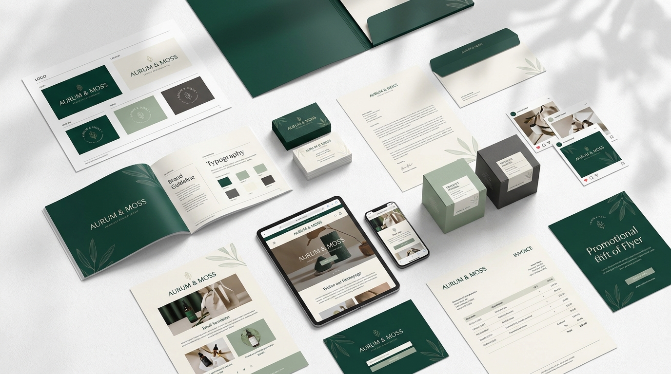
Many business owners believe branding is finished once the logo has been approved. Unfortunately, that’s where many branding projects begin to lose consistency. Customers spend very little time looking at a logo by itself. They interact with websites, presentations, social media graphics, packaging, business cards, brochures, invoices, and email signatures. If those materials don’t share the same visual language, the logo alone cannot create recognition.
A professional brand identity should include logo variations, typography, color systems, graphic elements, icon styles, photography direction, spacing rules, and layout principles. These components form a visual system that can be applied consistently across every platform. Over time, customers begin recognizing the entire system instead of relying on the logo as the only identifier.
Choose Consistency Over Creativity
One of the biggest mistakes businesses make is constantly changing their visual style. A new marketing campaign introduces different colors. Social media adopts another typography style. The website follows one design direction while printed materials follow another. Each change may appear harmless, but together they weaken the identity customers have started to recognize.
Consistency is often less exciting than creating something new, yet it produces far stronger results over time. Customers remember repeated experiences. When the same typography, colors, layouts, and visual language appear across every customer touchpoint, recognition grows naturally. A consistent brand also appears more professional because every interaction feels intentional rather than improvised.
Build a Flexible Visual System
Your brand identity should work equally well across digital and printed media. A logo that looks perfect on a website but becomes unreadable on packaging or embroidered uniforms quickly creates practical problems. The same applies to color palettes that perform well on screens but lose impact in print, or typography that becomes difficult to read on smaller devices.
Designing a flexible identity means considering every environment where the brand may appear. Websites, mobile devices, presentation slides, signage, business cards, brochures, product packaging, advertising banners, and social media graphics should all feel connected without requiring separate branding systems. Flexibility makes future marketing easier while preserving the consistency that customers expect.
Let Quality Create Differentiation
Many brands try to stand out by adding more visual elements. Extra colors, decorative graphics, complex logos, and elaborate layouts often create the opposite effect. Instead of appearing distinctive, the identity becomes crowded and difficult to recognize. Simplicity doesn’t make a brand ordinary. It makes the important elements easier to remember.
Professional branding focuses on refinement rather than decoration. Every visual component should have a clear purpose and contribute to the overall identity. Well-balanced typography, thoughtful spacing, carefully selected colors, and consistent layouts usually communicate far more confidence than excessive visual complexity. Customers tend to trust brands that appear organized and intentional because the design reflects the same qualities they expect from the business itself.
Create Recognition Through Every Customer Touchpoint
Customers rarely experience a business through a single interaction. Someone might discover your company through a Google search, browse your website, follow your social media pages, receive a proposal, and later purchase your services. Each interaction should reinforce the same identity rather than introducing a completely different visual style. Every touchpoint becomes another opportunity to strengthen recognition and build trust.
This is why professional businesses treat branding as an ongoing system rather than a one-time design project. Every new brochure, presentation, advertisement, website page, or social media graphic should feel like a natural extension of the same brand. When customers repeatedly experience that consistency, they begin recognizing your business almost instantly, even before they consciously notice the logo.
Invest in a Brand Identity That Supports Growth
As businesses grow, branding becomes more challenging. New products are introduced, marketing expands across multiple platforms, and additional team members begin producing design assets. Without a structured identity system, inconsistencies become inevitable. Fonts change, colors drift, layouts evolve independently, and recognition gradually weakens. Investing in a professionally developed brand identity early creates a strong foundation that supports future growth instead of requiring frequent redesigns.
A custom brand identity is also designed specifically around your business rather than relying on generic templates. It reflects your positioning, target audience, and long-term goals while providing the flexibility needed for future marketing. Instead of repeatedly redesigning materials to fix inconsistencies, every new project starts with an established visual system that already communicates professionalism and trust.
Conclusion
Designing a brand identity that stands out isn’t about creating the boldest logo or following the latest design trend. It’s about building a visual system that consistently represents your business across every customer interaction. When strategy, typography, colors, layouts, imagery, and communication all support the same identity, recognition becomes a natural result rather than something you constantly chase.
If you’re building a new business or your current branding no longer reflects the quality of your company, investing in a professionally designed brand identity can make a significant difference. A custom branding system tailored to your business helps create stronger first impressions, improves consistency across every platform, and provides a solid foundation for future marketing as your business continues to grow.
Frequently Asked Questions
What makes a brand identity stand out?
A brand identity stands out when it combines clear positioning, consistent visual design, and a recognizable personality that remains the same across every customer touchpoint.
Is a logo enough to create a strong brand identity?
No. A logo is only one element of a complete brand identity. Typography, color palettes, layouts, imagery, brand voice, and design guidelines all contribute to how customers recognize a business.
Why is consistency important in branding?
Consistency helps customers recognize your business more quickly, builds trust, strengthens credibility, and creates a professional experience across websites, social media, packaging, and marketing materials.
How often should a business update its brand identity?
Most businesses should refine their brand identity gradually rather than redesigning everything at once. Small improvements help keep the brand current while preserving the recognition already established.
Should I hire a professional designer for my brand identity?
If branding plays an important role in your business growth, working with a professional designer can help create a strategic identity that remains consistent, scalable, and effective across every marketing channel.
External References
- Adobe Color — https://color.adobe.com/
- Pantone — https://www.pantone.com/
- Google Fonts — https://fonts.google.com/

Pingback: Consistent Brand Identity