
Design Tips & Education
How to Design Better Educational Posters
Aug
Introduction
Walk into almost any classroom, school hallway, or training center and you’ll find posters everywhere — the periodic table, classroom rules, motivational quotes, safety instructions, event announcements. Most of them get ignored within a week.
That’s not because posters don’t work. It’s because most posters are designed without any real design thinking behind them. Someone opens a document, adds a title, pastes in some text and clip art, prints it, and hopes for the best.
Educational posters have one job: communicate an idea quickly, clearly, and memorably, often to an audience that isn’t actively trying to read it. A student walking past a hallway poster gives it maybe two seconds of attention. A poster taped to a classroom wall competes with dozens of other posters, decorations, and distractions. If the design doesn’t work, the message never lands — no matter how good the content is.
This guide walks through what actually makes an educational poster effective, the mistakes that quietly undermine most classroom and school designs, and a practical workflow you can follow whether you’re a teacher making your own materials, a school marketing team producing print collateral, or a business creating training visuals. By the end, you’ll understand not just what to change, but why it matters.
Why Educational Poster Design Matters More Than You Think
It’s tempting to treat poster design as a minor task — something to knock out quickly between lesson planning and grading. But posters are often a school’s or organization’s most visible, most repeated form of communication. A single poster can be seen hundreds of times by the same student over a semester.
That repetition is powerful. Well-designed posters reinforce information passively, the same way a good sign in a supermarket guides you without you noticing it’s guiding you. Poorly designed posters do the opposite: they create visual noise that trains people to stop looking.
There’s also a trust factor. Schools, tutoring centers, and educational businesses are judged on professionalism just like any other organization. Cluttered, inconsistent, or dated-looking posters can quietly undercut the credibility of an otherwise excellent institution. Clean, considered design signals that the organization cares about how it presents information — and, by extension, how it teaches.
Finally, good poster design supports actual learning outcomes. Research in cognitive load theory and visual learning consistently shows that people absorb information faster when it’s structured clearly, when hierarchy guides the eye, and when unnecessary decoration is removed. A well-designed poster isn’t just more attractive — it’s more effective at its actual job, which is teaching.
The Core Principles of Effective Educational Poster Design
Every strong educational poster, regardless of subject or audience, is built on the same foundational principles. Get these right and almost any poster will improve dramatically.
Visual Hierarchy
Visual hierarchy is the order in which a viewer’s eye moves across a design. On a poster, this usually means: headline first, supporting visual or key statistic second, body text third, and any fine print or logo last.
The mistake most non-designers make is treating every element as equally important — the title is the same visual weight as the body copy, the illustration competes with the text instead of supporting it. A poster with no hierarchy forces the viewer to work to figure out what matters, and most people simply won’t bother.
A practical test: squint at your poster from a few steps back. If you can’t tell what the single most important element is within a second, the hierarchy needs work.
Color Psychology in Educational Design
Color isn’t decoration — it’s information. Color can indicate urgency (safety posters often use red and yellow), warmth and approachability (early childhood materials often lean toward soft, saturated primaries), or subject identity (many schools color-code posters by department or grade level).
For educational contexts specifically, color should support readability first. High contrast between text and background is non-negotiable — light gray text on a white background might look modern in a portfolio, but it’s nearly unreadable from across a room. A simple rule: dark text on a light background, or light text on a dark background, with strong contrast in between.
Limiting a poster to two or three main colors, plus a neutral like white or dark gray, almost always looks more professional than five or six competing hues.
Typography That Works for Learning
Typography is where most DIY educational posters fall apart. Common issues include using too many fonts, choosing decorative fonts for body text, and sizing text so small it’s unreadable from a normal viewing distance.
A few reliable rules:
- Use no more than two typefaces — one for headlines, one for body text.
- Headlines should be legible at a glance; playful or script fonts belong in small doses, if at all, never in long text blocks.
- Body text needs generous line spacing. Cramped text is one of the fastest ways to make a poster feel overwhelming.
- Consider the actual viewing distance. A poster meant to be read from across a classroom needs dramatically larger text than one meant to be read up close.
Whitespace and Breathing Room
Whitespace — the empty space around and between elements — is one of the most underused tools in educational design. The instinct is often to fill every inch of a poster with information, especially when there’s a lot of content to communicate. This backfires. A crowded poster reads as noise, and the brain tunes it out.
Professional designers treat whitespace as an active design element, not wasted space. Margins, gaps between sections, and padding around text all give the eye somewhere to rest and make the actual content easier to process. If a poster feels tight, the fix is usually to remove content, not shrink the design further.
Common Mistakes That Weaken Educational Posters
Even well-intentioned posters tend to repeat the same handful of problems. Recognizing them is the fastest way to improve.
- Too much text. A poster is not a handout. If it needs paragraphs to explain itself, it should be a document, not a poster. Aim for a single core message plus a few supporting points, not a full explanation.
- Inconsistent alignment. Text and images placed without a shared grid create a visually messy, unfinished look, even when the content itself is solid.
- Clashing or excessive fonts. More than two typefaces almost always looks unpolished rather than creative.
- Low-resolution images. Stretched or pixelated graphics are one of the fastest ways to make a poster look unprofessional, especially once printed at full size.
- No clear focal point. Without a dominant headline or image, viewers don’t know where to look first, and many won’t look at all.
- Ignoring the viewing distance. Designing on a laptop screen makes it easy to forget that a poster will often be viewed from several meters away.
- Overusing clip art or stock decoration. Generic graphics can make even good content feel amateurish; purposeful, relevant visuals communicate far more.
A Professional Workflow for Designing Educational Posters
Professional designers rarely start by opening a design tool and typing a headline. They follow a process. Here’s a simplified version that works whether you’re designing for a single classroom or an entire school district.
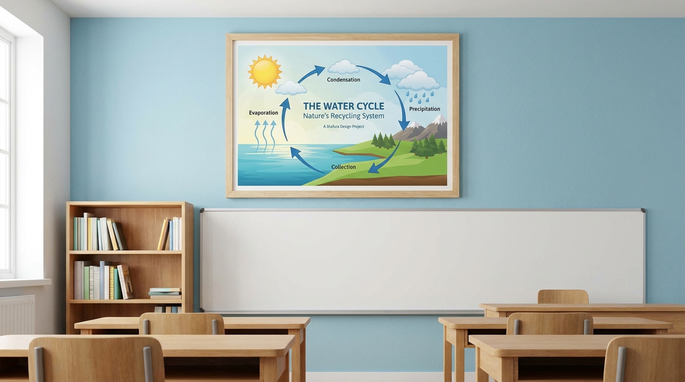
1. Define the single goal. Before anything else, decide exactly what the poster needs to accomplish — one goal, not five. “Explain the water cycle” is a goal. “Explain the water cycle, promote the science fair, and remind students about the library hours” is three posters pretending to be one.
2. Identify the audience and context. A poster for kindergarten classrooms needs different visual language than one for a university lecture hall. Consider age, reading level, and where the poster will physically be seen.
3. Draft the content first, separately from the design. Write the headline, key points, and any supporting text as plain text before opening a design tool. This keeps the message focused and prevents the design process from being driven by how much space is left over.
4. Sketch the layout. Even a rough thumbnail sketch — headline top, image center, three key points below — saves significant time later and forces early decisions about hierarchy.
5. Choose a consistent visual system. Pick your color palette and two fonts before adding content. Reusing the same system across multiple posters also builds recognizability over time, which matters for schools producing many posters throughout a year.
6. Design, then edit down. Build the full poster, then look for anything that can be removed. Nearly every first draft benefits from cutting text, simplifying imagery, or increasing whitespace.
7. Test at real scale and real distance. Print a draft, or view it at actual size on a large screen, and step back to the distance it will actually be viewed from. Problems that are invisible on a laptop screen often become obvious immediately.
8. Get a second opinion. A colleague, another teacher, or a design professional can spot confusion or clutter that’s hard to see after staring at your own work for hours.
Design Tips for Different Types of Educational Posters
Not every educational poster serves the same purpose, and the design approach should shift accordingly.
Classroom rules and routines posters benefit from icon-based design — a small icon paired with a short phrase communicates faster than a full sentence, especially for younger students who may not yet be strong readers.
Subject or concept posters (science diagrams, historical timelines, grammar rules) need the clearest hierarchy of all, since they’re often referenced repeatedly. Labeling, numbering, and consistent color-coding for related information help students navigate the content without re-reading everything each time.
Event and announcement posters are closer to marketing materials. These benefit from a strong focal image, a clear date and call to action, and enough contrast to stand out in a hallway full of competing announcements.
Motivational or inspirational posters rely heavily on tone. Overly generic stock imagery and clichéd phrasing tend to blend into the background after the first week; a distinctive visual style and a message specific to the school or class tends to hold attention longer.
Safety and procedural posters prioritize instant clarity above all else. Numbered steps, high-contrast color coding, and minimal text ensure the information can be understood in an emergency or at a glance, not just during a calm read-through.
DIY (Canva) vs. Hiring a Professional Designer
Tools like Canva have made poster design far more accessible, and for many quick, informal classroom needs, a well-made Canva poster is perfectly appropriate. Templates provide a helpful starting structure, and the principles covered in this guide — hierarchy, contrast, limited fonts, whitespace — apply just as much inside Canva as they do in any other tool.
That said, there’s a meaningful difference between a poster made from a template and one designed specifically for a school’s or organization’s identity, audience, and goals. A few situations where professional design tends to pay off:
- School-wide branding, where posters, signage, and materials need to feel consistent across an entire institution, not just within one classroom.
- Recurring campaigns, such as enrollment drives, open houses, or annual events, where a distinctive, memorable visual identity builds recognition year over year.
- Complex information, like infographics, curriculum overviews, or multi-step processes, where poor hierarchy can genuinely confuse rather than clarify.
- High-stakes materials, such as safety instructions or official communications, where clarity and professionalism directly affect trust.
This is an area where a studio like Shafura Design typically supports schools, teachers, and educational organizations directly — building custom educational poster design, infographic design, and consistent branding design systems that go beyond what a template can offer, while still keeping the process fast and collaborative for busy educators and marketing teams.
Print vs. Digital: What Changes in the Design
Educational posters increasingly live in both formats — printed for hallways and classrooms, and shared digitally through school websites, social media, or presentation slides. The core design principles stay the same, but a few technical details shift.
For print, resolution matters enormously. Images and graphics need to be high resolution (300 DPI is the standard for most print poster sizes) to avoid a blurry or pixelated final product. Color also behaves differently in print (CMYK) versus on screen (RGB), so colors can shift slightly once printed — something worth checking with a proof before a large print run.
For digital, file size and screen readability matter more. A poster shared on social media or a school website needs to work at a much smaller viewing size, which often means simplifying text further and ensuring the focal point is still clear even when shrunk down to a thumbnail.
Designing with both formats in mind from the start — rather than trying to convert a print poster into a digital one after the fact — almost always produces a cleaner result in both formats.
Frequently Asked Questions
What size should an educational poster be? It depends on the viewing context. Classroom wall posters commonly range from A3 to A1, while hallway or event posters are often larger. The right size depends on the viewing distance — the further away people will stand, the larger the text and key visuals need to be.
How much text should a poster include? As little as possible while still communicating the core message. A poster should convey its main idea in a few seconds; anything requiring sustained reading is better suited to a handout or slide.
What fonts work best for educational posters? Clean, highly legible sans-serif fonts generally work best for headlines and body text, especially for younger audiences. Decorative fonts can be used sparingly for accents but should be avoided in body text.
Can I design a good poster in Canva without design experience? Yes, especially for simple, informal classroom needs. Applying the principles in this guide — hierarchy, limited fonts, strong contrast, and whitespace — will meaningfully improve a Canva design even without formal training.
How many colors should an educational poster use? Two to three main colors plus a neutral tends to look the most professional. More than that often creates visual clutter rather than added clarity.
Should every poster in a school look the same? Not identical, but a shared visual system — consistent fonts, color palette, and layout style — helps build recognition and a sense of institutional professionalism across different posters and departments.
What’s the biggest mistake teachers make designing posters? Including too much text and too many competing visual elements, which removes any clear hierarchy and makes the poster harder, not easier, to understand at a glance.
When does it make sense to hire a professional designer instead of DIY? When the poster is part of a larger branding effort, needs to communicate complex information clearly, will be reproduced repeatedly, or represents the organization in a high-visibility or high-stakes context.
Conclusion
Educational posters are one of the most repeated, most visible forms of communication in any school or learning environment — which makes their design far more important than it usually gets credit for. The difference between a poster that gets ignored and one that actually teaches almost never comes down to the content itself. It comes down to hierarchy, contrast, typography, and restraint.
Start with one clear message. Build a strong visual hierarchy around it. Limit your colors and fonts. Give the design room to breathe. Test it at the size and distance it will actually be viewed. These principles apply whether you’re designing a single classroom poster in Canva or planning a full set of branded materials for an entire school.
If you’d like an experienced design partner for your school, classroom, or educational organization, Shafura Design works with teachers, schools, and educational businesses to create posters, infographics, presentations, and branded materials that are genuinely designed to communicate — not just decorate. Reach out to talk through your next project.
